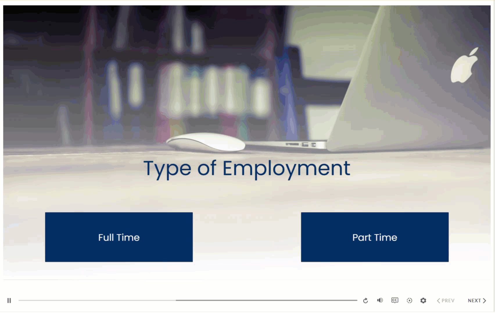
Here at Yukon Learning, we love building interactive courses – it’s kind of our thing! Interactive elements are key components of e-learning. They’re the objects learners select to make things happen in a course, whether it’s revealing a new layer, submitting an answer to a question, or branching to a new section. While we often refer to them as “buttons,” they can actually be any selectable item, such as shapes, images, or icons.
What the button does is important, of course, but often what the button looks like may become an afterthought for new course developers. This month, we’re answering this “as heard in training” question: “How can I use animated buttons to improve my Storyline 360 course design?”
Why Animate Buttons?
Animated buttons can help guide the learner’s eyes to where action is needed, or give a visual indicator of where they’ll move to in the course once they select something. A great example is using a slight pulse animation on a specific button; it clearly shows learners where to select without cluttering the screen with instructions.
Animation usually signals that something is clickable and interactive. Triggering an animation effect to a hover or a click reassures learners that their input is recognized, and that they’re actively engaging with the slide content. This can help a learner understand what’s happening, and what might happen next.
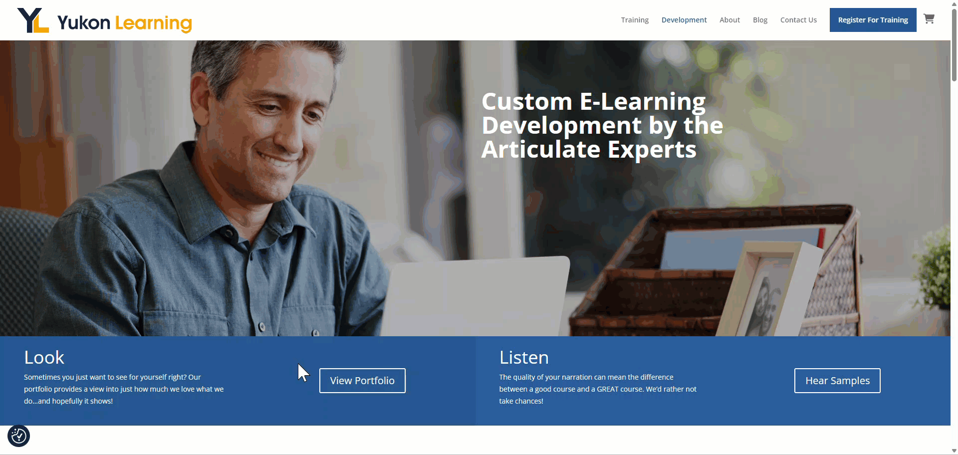
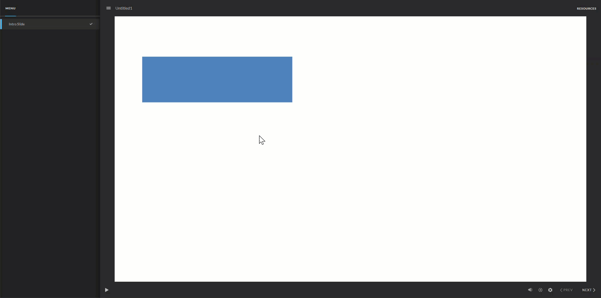
In addition to improving the learner experience, animating buttons can give your course a more polished, engaging, and modern feel. Visit almost any website and you’re likely to find animated buttons, like this one on our Yukon Learning site:
Design Principles
Before we review the how, let’s first consider two key things when designing animated buttons in your Storyline 360 courses.
- First, there should be a purpose to the animation. Animation should enhance clarity, not be a distraction.
- Second, be consistent with the animation styles across your course. Using a consistent animation style sets clear expectations for how your interactions are supposed to work, and provides a cohesive design style.
Ready to create an animated button? Today, we’ll cover two of our favorite animation approaches, beginning with the straightforward built-in emphasis animation.
Let’s find out how it’s done.
Option 1: Use the Built-In Emphasis Animation to Grow on Hover
In this first example, we’ll create a button that grows in size to create emphasis when the learner hovers over it. To do so, we’ll start by inserting a shape onto a Storyline 360 canvas, and then adjust its color appropriately.
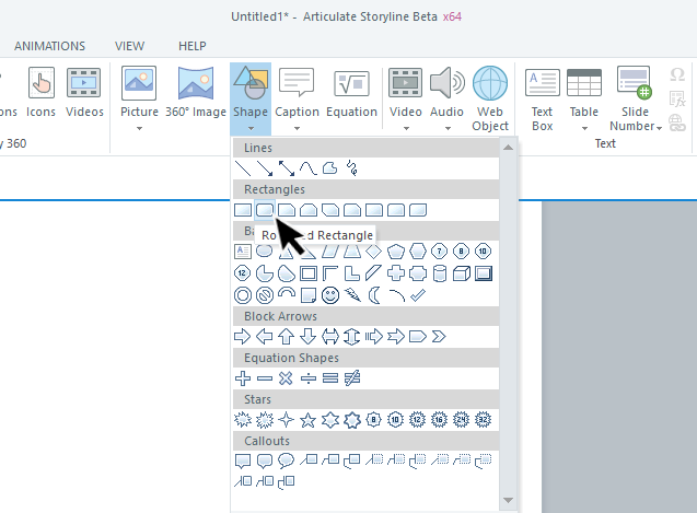
With your shape selected, go to the Animations tab, and select the Grow emphasis animation.
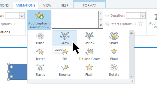
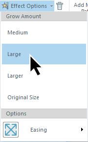
While you’re on the Animations tab, you can also adjust the Effect Options to control how much the object grows and how long the animation lasts.
The last step is to modify the trigger that Storyline 360 automatically created. Remember that triggers answer two questions:
- What do you want to do?
- And when do you want to do it?
In this case, our emphasis animation automatically created a trigger for when the user selects the object. We actually want it to activate when they hover over it instead. To fix this, we need to change the “when” condition on the trigger to when the “user hovers over” the object.
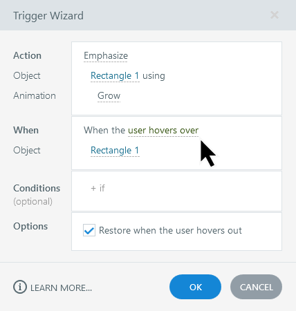
We’ll leave the box checked to “Restore when the user hovers out”, which sets the button back to its normal size when the learner’s cursor is no longer over it.
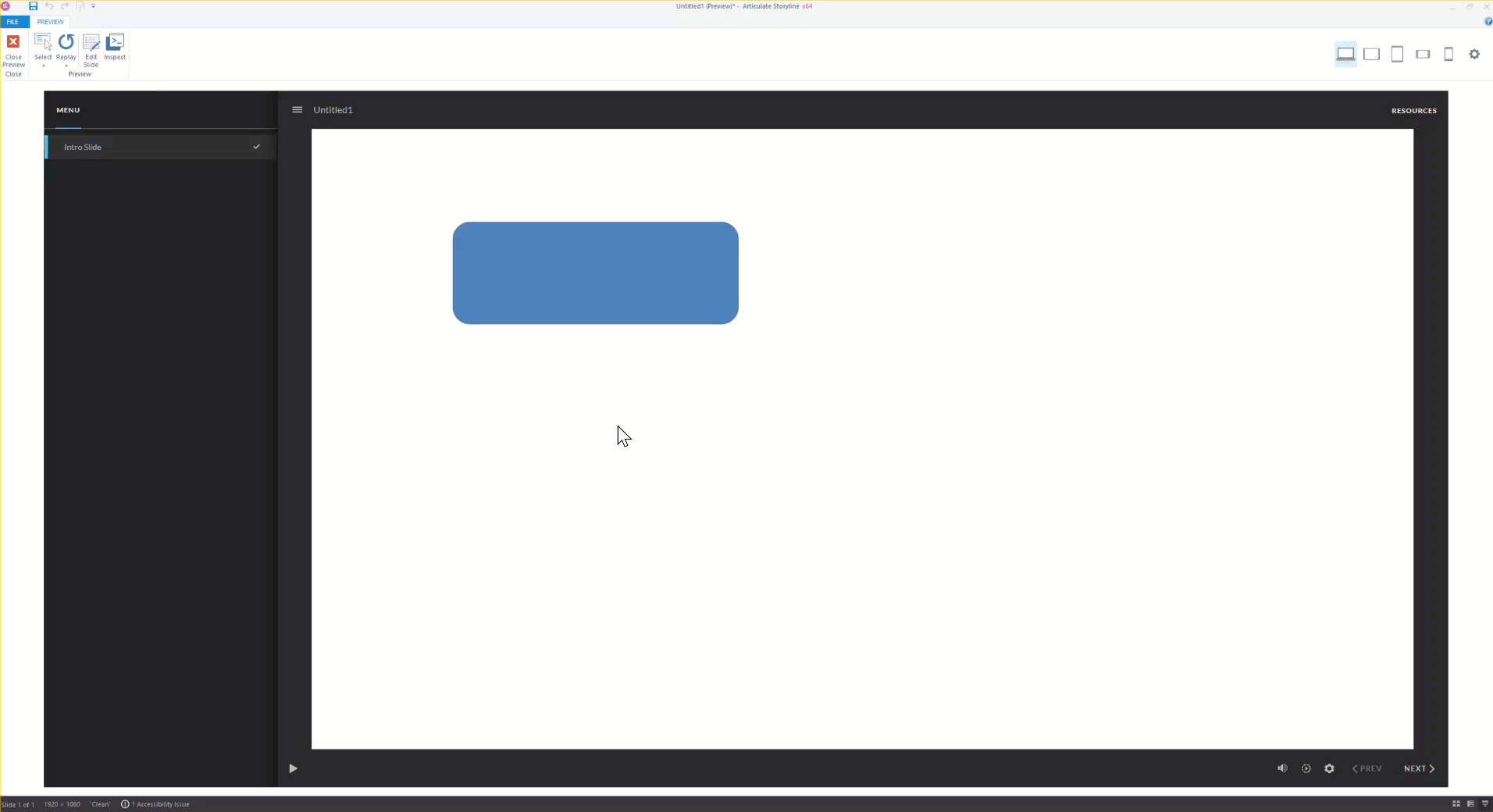
And voila, we have an animated button that grows in size on hover!
Option 2: Animate Buttons Using States
You probably noticed in our first example that we didn’t touch any of the states of the object on the screen – we just let the built-in emphasis animation do all the work. But another option is to work with animation inside of the states of your object.
For example, maybe we want to create an interactive button with hover animation showing a darker blue accent sliding in from the bottom.
To achieve this effect, we need to add and modify the hover state of our button.
- First, we’ll select the object, then select Edit on the States tab.
- From there, we’ll select the New State icon to add a new “Hover” state.
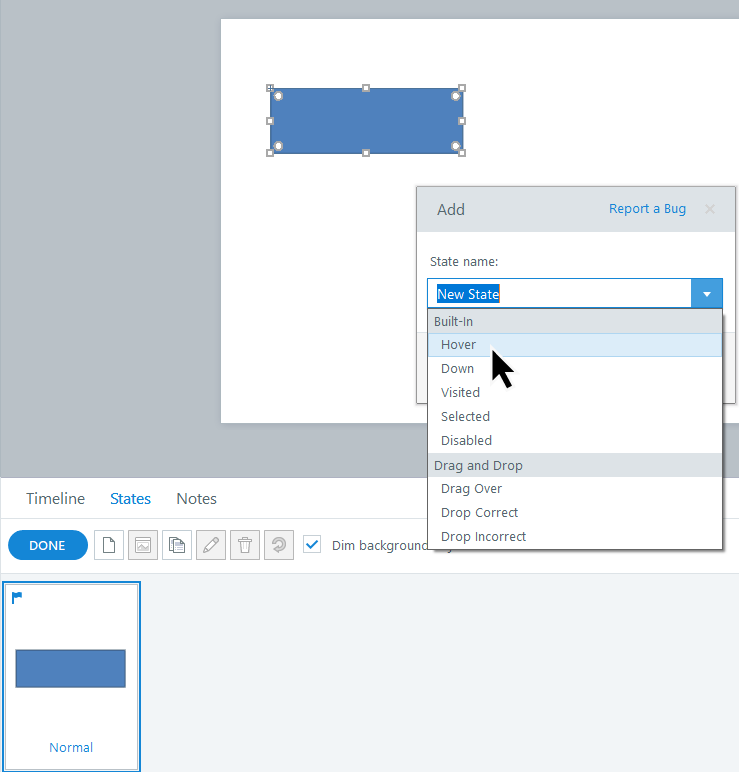
- Once the hover state is created, we’ll insert a new shape into that new state and change its color.
Tip: Make sure you are in the Hover state when adding the new shape (and not the Normal state).
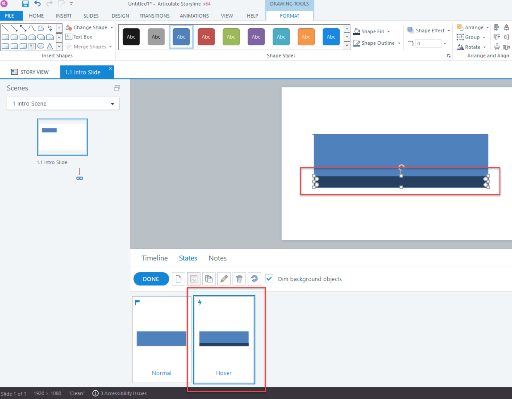
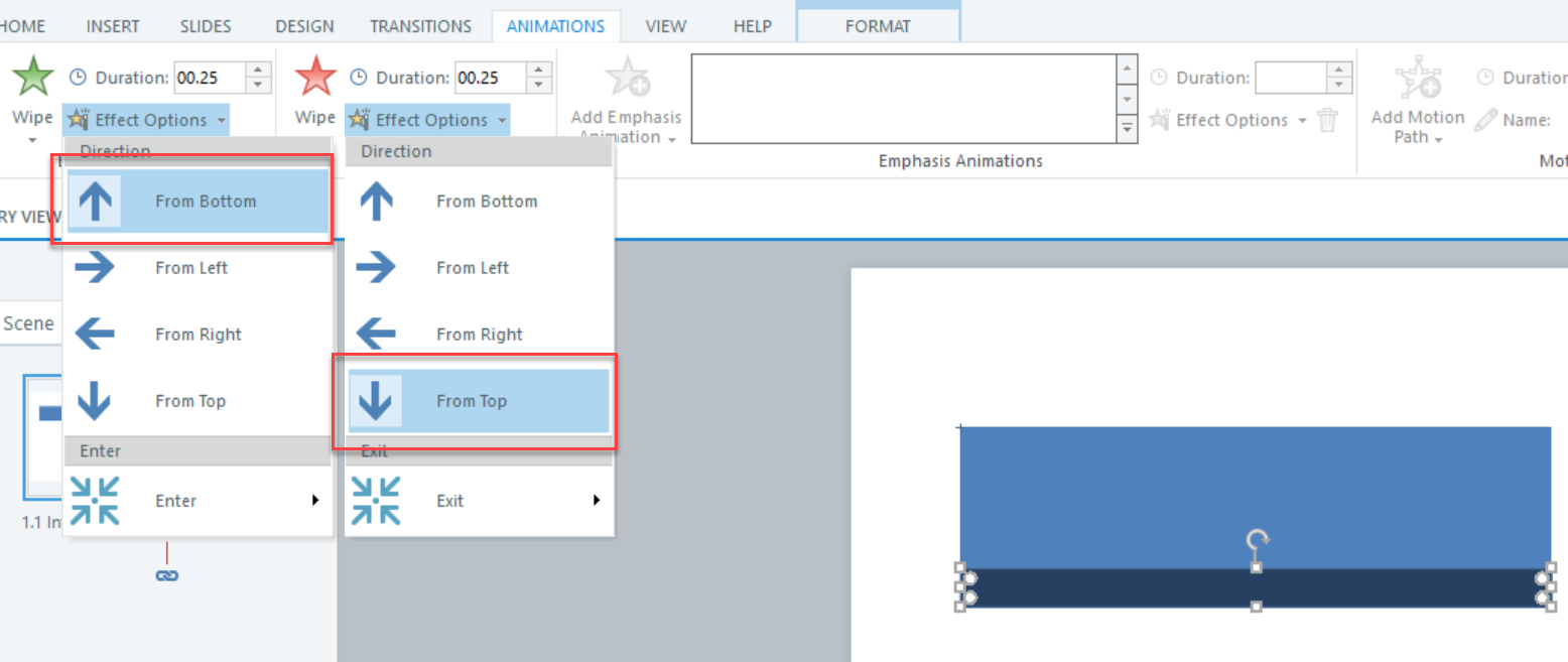
- Next, we’ll animate the new shape on the hover state.
For our example, we’ve set a Wipe entrance animation from the bottom and a Wipe exit animation from the top. We’ve also adjusted the duration of both the entrance and exit animations to 0.25 seconds. Now, only the additional shape that we added inside of the button’s hover state is going to animate when the learner hovers over the shape.
And boom! We’ve now got an animated button that reveals a new shape on hover…so pretty right?! The best part is, once we have our button just right, we can easily reuse it anywhere in our course.
Have you thought of any creative ways to animate buttons in your course? Drop a comment or reach out if you’d like to share!
Want More on this Topic?
For more information about animating buttons, check out the following resources from Articulate and our YouTube channel:
Create Animated Buttons with Storyline 360 (Articulate Webinar)
Everything You Need to Know About States in Storyline 360
How to Build Animated Buttons in Articulate Storyline 360 (Video)
Until next time … happy Articulating!

~ Elizabeth
Leave a Reply